Hey there, you enterprising spirit! Ever momentarily found yourself lost in a tangle of shades and hues while optimizing your website or app? If that's a nod, then you've danced with "color contrast problems". And trust us, it can be as tricky as a fox on roller skates. Everyone understands the irresistible allure of a splashy website or an app that paints a vibrant party for the eyes. Yet, our love for a palette we adore can sometimes spark quite a conundrum in ensuring accessibility for everyone. Tricky, right? That’s where this jovial guide comes in, ready to wrangle all your color contrast uncertainties with wit and candor. Together, we'll uncover the ropes of decoding color clash catastrophes, waltz through impacting accessibility, and light the lantern of clarity on the bells and whistles of optimal color contrast tools. From de-mystifying pricing options to auditing the fallout we may face by choosing to turn a blind eye to these pesky problems, we've got the full scoop. By the end, all your pressing questions about color contrast will be answered and the whole conundrum will seem less like unruly chaos and more like a captivating game of Technicolor Twister. So, are you game? Come on, let's dive into this head-first and unpick the puzzle that is color contrast problems. Together, we'll ensure that your website or app isn't just a treat for the eyes, but an accessible oasis for all your users. Bet this splash of an adventure is exactly what your entrepreneurial streak was thirsting for!
Understanding the Basics of Color Contrast Problems
Imagine going to your favorite restaurant, super excited to enjoy your scrumptious meal. However, upon arrival, you find yourself floundering in a playground of a menu, filled with red text on a green background. Now, squinting so hard you could make diamonds, you're about to throw two dart at the menu and see what you hit as that’s as good as its going to get with this color shenanigans. Sounds frustrating, right? That's precisely how color contrast problems rear their unattractive heads on your entrepreneurial initiatives. Essentially, color contrast issues pop up when the colors used in text and background jumble like oil and water. It's like coffee and pickles. Strange and awful! These impair visual readability, particularly for those grappling with visual impairments. Often, your users are left squinting at screens, feeling frustration creep in while engagement creeps out. For budding tech entrepreneurs, this is a hurdle that can hurt accessibility, UX, inclusivity—and ultimately your bottom line. Think of color contrast as Jeff Bezos and Bill Gates. In their prime, both ]majestic, indispensable tech heads—but when you compare and contrast, the differences leap out. Same goes for color contrast problems: the smarter your color choices, the more accessible and user-friendly your content. For instance, contrast like black-on-white is a beacon of hope for clear visibility compared to faint gray-on-white which causes a digital snowstorm of confusion. Remember, when the contrast is low your text becomes the Bermuda Triangle—navigational nightmare central. So, avoiding risky contrast combinations could very well be your business's GPS to achieving optimal readability, and, ultimately, customer satisfaction. Of course, building on the insights we've got so far, it's clear color contrast errors aren't stuff of tech entrepreneurs' dreams. Yet, dialed in right, with knowledge tucked under your arm, and eagerness popping in your eyes—you could flip the script and transform a gnarly situation into an opportunity to spotlight accessibility. Now, who's ready to embrace this wild ride of solving color contrast problems, otherwise lovingly known as the entrepreneur's eye test? Let's dive deeper, shall we?
Exploring the Impact of Color Contrast on Accessibility
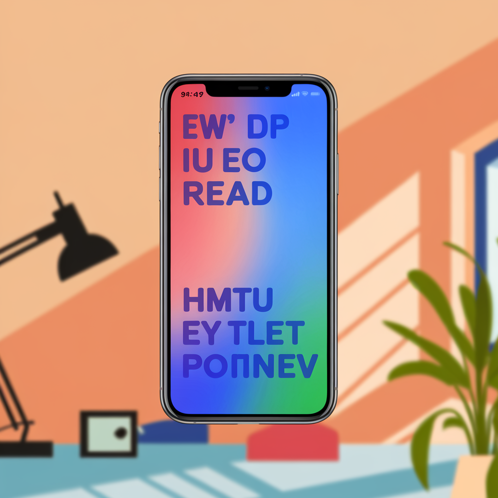
To get to the root of these reproduction-skewed outlaws, think of reading your favorite much-needed financial forecast on your phone while lounging in dappled sunlight – it doesn't work, does it? The words blend into each other, and you're left gnawing your lip in frustration. Well, that's exactly how your audience feels when grappling with websites sporting poor color contrast. All entrepreneurs naturally crave visually appealing sites. However, sacrificing legibility due to color contrast issues multiplies accessibility problems tenfold. Hues too similar to each other cause content and interactive elements to bleed into each, making texts and buttons indistinct. Now picture color-treated hair in all its glory – high color contrast results in better manageable tresses that frame the face, just as it does in enhancing legibility and usability on websites. On the other hand, a tech-superstar solution—equipped with a royal flush of compliant color contrast!—sensationally slams down accessibility limitations. It fashions your webpage into a well-lit path, with signs readable even in dim twilight. Whipping up a triumph over your tech foes with smartly selected color contrast benefits not only visually impaired users but also benefits regular users exposed to counterproductive ambient lighting scenarios. Talk about a winning hand, hey amigo? By bundling up the glove of practicality with the punching power of spectacular, compliant color combinations, as an entrepreneur, you stride toward creating a globally accessible, inclusive digital interface. Why settle for tickling your eardrums with the empty clink of beautiful but ineffective color combinations when you can orchestrate a harmony of functionality and attractiveness? Your business venture's true success lies in justifiable compromise; it's time to stop treating color contrast issues as mere aesthetic game plays but as a serious engagement strategy. Are you game for this, partner?
Key Features to Look for in Color Contrast Tools
Just as in a superhero movie, our story's next twist leads us to the heart-throbbing confrontation – comparing the features of color contrast tools. Like battling mortal enemies, each tool we consider holds a unique power or advantage. Let's jump straight into discovering which hero, ahem… tool, proves most worthy of your trust. Team 'Automatic Color Correction' kicks it off, bearing the gifts of efficiency and simplicity. Like the sunset bringing calm after a storm, an automatic correction feature sweeps in to tackle any potential color contrast problems. While super handy for rookie tech-preneurs, it might not provide enough control for those with "trust issues". Ha, been there! Venturing next into the plethora of Web Accessibility Initiative Guidelines, you'll find some great adjustability options. These are the biz for crafty entrepreneurs wishing they had Hermione's time turner, providing a chance to alter how visitors perceive their webpage. However, take care—tweak gently to avoid the trap of the “migraine-inducing technicolor nightmare.” The last tool lurking in our sandwich bag of options, is the 'Color Blind Simulation'. A bit like a 'choose-your-own-adventure' book, this feature offers insights into every corner of the color contrast problems highway—particularly important when considering users with color vision deficiency. Piecing these comparisons together, it seems like a jigsaw puzzle where choice and balance are key. Take a shot at it—one wrong piece and it’s game over, yet the right blend could secure your place in the Hall of Fame. So, entrepreneur compadres, buckle up! It's time to turn these nuggets of wisdom into powerful decisions.
Comparing Pricing Options for Color Contrast Solutions
The breezy, techie world of entrepreneurs can sometimes feel like wandering through an enchanted forest in near total darkness. But don’t sweat it; we're here to shed some light on the maze of Color Contrast Solutions! Two words— "color contrast problems." It's like broken traffic lights causing a gridlock downtown. Deciding the ideal tool, we’ll be wavering between free and subscription-based services. Think of this predicament as tapping between espresso and a Macchiatto when on a shoestring budget. Besides, who doesn’t love a good twist in the tale, huh? Remember when we marveled over the fact that both options—free tools like WebAIM's and subscription-based ones like Colorable—serve up superior accessibility and usability solutions, countering dominant color contrast obstacles? Well, now's when the plot thickens. On one end, free color contrast tools like WebAIM's are great for those quick, one-off checks. It's that reliable old bicycle—a little wobbly and rusty but gets you from point A to point B! You pop your colors in and voila! Quick advice on color contrast problems unfolds before you. But remember, just like an old bike can't really compete in a cross-country race, free tools might not always scale up in larger, more complex projects. Switching gears, let's look at our other option – subscription-based tools like Colorable. Sure, they burn a little hole in the pocket at around $9 a month, but the added perks justify the cost. Full-scale project analysis, automated website-wide scans, accessibility regulation certification—think of it as your techy space mission where you’ve got your safety gear on. In the world of solving color contrast problems, the factor to ponder over lies not in the contrast checks, which we know both systems do brilliantly. The true divider here is scale and extent—in-depth analysis or quick, surface solutions. What's the entrepreneurial call here, my friend? A tried tested free utility bike ride or a cost-incurring techy space mission? You're the captain of this ship!
Evaluating the Drawbacks of Ignoring Color Contrast Issues
Expanding on the differences observed, let's chat about the unfriendly terrain of ignoring color contrast problems— like overlooking a rather large crater on the moon. It may not affect you instantly, but its ripple effects can cause a tech tornado in your entrepreneurial journey. Imagine, your fantastic new app or website looks like a top-drawer design. However, for some users, it's as confusing as a maze in the dark. Mismatched color contrasts can bring about accessibility issues, often leaving some users lost in the digital wilderness. My friends, think about those subtle, elegant palettes on your user interface— sleek greys, dreamy whites, and cool blues. Yes, they are stunning, but sometimes these color schemes are like whispering directions to someone across a noisy room. Illegible. This is where color contrast problems make their sneaky entry. When color ratios go astray, it not only impacts legibility but also usability. Suddenly, your app becomes as navigable as a kayak in a hurricane. Now, that's a ride you wouldn't want to embark on, right? Remember, when designing for business, getting artistic with Picasso-like palettes can be fun, but may turn into a marshmallow in a keyhole situation. You're trying to fit something where it simply doesn't. Instead, throwing in high-contrast hues that are as evident as a lighthouse in the dark, ensure that everyone sees things clearly. It won't just pump up the accessibility factor but will also shout your brand values of transparency and openness. Taking this all into account, ignoring color contrast problems is akin to pocketing the spare change— seems inconsequential now, but you’ll miss its worth on a rainy day. So, dare to dabble in this color play, will you? It's not just about keeping users from tripping up in your digital eco-sphere; it's about letting them comfortably live in, making it their very own snuggly corner. After all, isn't that the entrepreneurial dream?
Addressing Common Questions About Color Contrast Problems
So, you're keen to tackle these pesky color contrast problems, right? We've been comparing different methods and tools like comparing the notes from a secret code. We can't help but notice a certain 'chalk and cheese' feel when it comes to automated tools and manual checks. Automated tools are a real-deal when it comes to detecting color contrast problems. Think about it as having a smart robot in a high-tech lab, scanning meticulously for accessibility issues with the precision of an orchestrated symphony. Cool, huh? Not to mention their efficiency. They can save you oddles of time by performing the task more quickly than Usain Bolt's 100m dash! However—and here's the spoonful of reality—they aren't as accurate as they are fast. These tools, for all their high-tech allure, can sometimes act more like a confused puppy lost in a maze. Usability issues often pop up like uninvited house guests. They may under-detect, or worse, over detect issues, kind of like eager toddlers spotting every candy bar and soft toy at the grocery store. And, oh boy, that can lead to a proper pickle! Switching gears, let's eyeball manual checks. These unique gems are the human touch your website craves. Kind of like a check-up with your favorite doc who knows your medical history better than their coffee order. Manual checking opens the door for personalized adjustments, keeping those usability issues at arm's length as much as your cat stays away from bath water. Care to try it? Why not tee one up in a bit and see how smoothly it can identify subtleties—those color contrast problems the tools might have missed. Sounds exciting, doesn't it? That being said, they can be a heck of a time sink, like watching paint dry, and might cause you to miss deadlines. Sub-optimal, right? By understanding these options, you're better armed to deal with color contrast problems. All you need now is a generous sprinkle of judgment. A combination of both methods could be the Batman and Robin combo you need, providing a balance between efficiency and accuracy.
Conclusion
So, how's that fresh cup of color contrast enlightenment tasting, my adventurous entrepreneurs? Hopefully we've served you well with an extra shot of insightful information about the impact of color contrast issues on accessibility and answered some gnawing questions we know were keeping you up late. But truth be told, it's been more than just infra-red techy jargon denser than a black hole. The conversation started from the basics and zoomed all the way to evaluating various pricing models and feature sets of different color contrast tools. With that digital palette now at your fingertips, it’s time for you to paint your techno-canvas like the enigmatic entrepreneur Picasso you are! See, we're not just dishing up geeky verbals here. It's all about ensuring you stay shaken and stirred by the realities this digital era throws at us every millisecond—like cunning color contrast that has the power to be either a sly adversary or a devoted ally, depending on how you wield it. So why not take a leap into the midnights and sunrises of your website and detect those devilish color contrast problems hidden like elusive unicorns in tall tech-grass? Ignoring them could make your digital life as gloomy as a screen with poor brightness, while addressing them can emit a technicolor pulse that attracts not only profits, but also garners respect. Your entrepreneurial journey doesn't need to feel like rocket science. Consider everything we've shared here as a seasoned astronaut's toolkit, equipping you to course-correct your digital spaceship's journey. One pixel at a time! Transform chaos into order, despair into hope, today. Strap in, ignite those thrusters, and conquer color contrast issues. Let's paint the digital universe in accessible, vibrant hues together, shall we?
FAQ:
Frequently Asked Questions What are color contrast problems and how do they impact accessibility? Color contrast problems occur when the distinction between the foreground and background colors isn't clear, making it challenging for some users, especially those with visual impairments, to access and interpret the data presented. Poor color contrast can limit readability, weaken user experience, and unfortunately, render some web content inaccessible for those with certain vision deficits. Why are color contrast tools integral? What features should I look for? Color contrast tools aid in ensuring that your website or app is accessible to all users, regardless of their visual capabilities. Key features to look for in these tools include a visually represented contrast ratio, WCAG (Web Content Accessibility Guidelines) conformance score, a robust color spectrum for testing, and attractive user interface. These powerful tools can help you anticipate and eliminate any potential contrast issues. What are the potential repercussions of overlooking color contrast problems? Ignoring color contrast problems can upset the balance of a well-designed user interface and significantly affect user interaction. Texts, buttons, or images with low contrast may become unreadable or hardly noticeable, limiting the functionality of your platform, resulting in dissatisfaction, and potentially lost users or customers. From an inclusive point of view, overlooked color contrast problems can result in excluding visually impaired users. Are there differences in the pricing of color contrast solutions, and what affects these differences? Just like most technology solutions, pricing for color contrast solutions varies. Factors affecting the price include the features offered, the user interface quality, the level of customer support, and additional services like periodic updates and customization options. Before you invest in one, make sure to compare pricing and offerings of different contrast solution tools, and choose one that aligns with your specific needs and budget.